


Web design is both an art and a science, and every design element, from layout to color and typography, plays a crucial role in how a website communicates and engages with its audience. One of the fundamental principles of web design is the Z-layout, a concept that guides the eye of the viewer and influences the flow of information on a webpage. In this comprehensive guide, we will explore the Z-layout in web design, understand its significance, and discover how to effectively implement it to create visually appealing and user-friendly websites.
What is the Z-Layout?
The Z-Pattern Explained
The Z-layout, also known as the Z-pattern or F-pattern, is a design principle that describes the typical path the human eye follows when scanning or reading content on a webpage. It is based on the natural reading patterns of Western cultures, where we tend to read from left to right and from top to bottom, forming the shape of the letter “Z” on the screen.
The Z-layout involves the following key points:
- Start at the Top Left: Users typically start their visual journey in the top left corner of a webpage, where the most critical information or logo is often placed.
- Scan Horizontally: From the top left, the eye moves horizontally across the page, taking in important elements like navigation menus, headlines, and key visuals.
- Move Diagonally: After scanning horizontally, the eye then moves diagonally from the top left to the top right, often catching secondary information or additional content.
- Finish at the Bottom Right: Finally, the eye scans horizontally once more, reaching the bottom right corner of the page. This is where users may find less crucial information, such as footer content or contact details.
The Psychology of the Z-Layout
Why Does the Z-Layout Matter?
Understanding the Z-layout is essential because it aligns with how users naturally consume information. By following this pattern, web designers can strategically place the most critical content where it’s likely to receive the most attention. Here’s why the psychology of the Z-layout matters:
- Efficient Information Delivery: The Z-layout allows you to present information in a logical and user-friendly manner. Users can quickly grasp the main message and navigate the page with ease.
- Emphasis on Key Elements: Placing essential elements like headlines, calls to action, and primary content along the Z-pattern ensures that they receive maximum visibility and engagement.
- Reduced Cognitive Load: Users don’t have to think too hard about how to navigate the page; the Z-layout guides them naturally. This reduces cognitive load and enhances the overall user experience.
- Mobile Responsiveness: The Z-layout works well on various screen sizes, making it a valuable approach for responsive web design.
Implementing the Z-Layout in Web Design
Key Design Elements in the Z-Layout
To effectively implement the Z-layout in your web design, consider the following design elements:
- Logo and Branding
Placement: Position your logo in the top left corner of the page, where users typically start their visual journey. This helps establish brand identity and reinforces your site’s credibility.
- Navigation Menu
Location: Place the main navigation menu horizontally near the top of the page. Users expect to find navigation options in this area.
Order: Organize menu items in order of importance or relevance, with the most critical items on the left side.
- Headlines and Content
Hierarchy: Utilize clear and concise headlines that convey the main message. Place them at the top of content sections to guide users through the page.
Readability: Ensure that content is scannable and easy to read, using short paragraphs, bullet points, and subheadings.
- Visual Elements
Images and Videos: Use visuals strategically to support and reinforce the content. Place them along the Z-pattern to draw the eye and provide context.
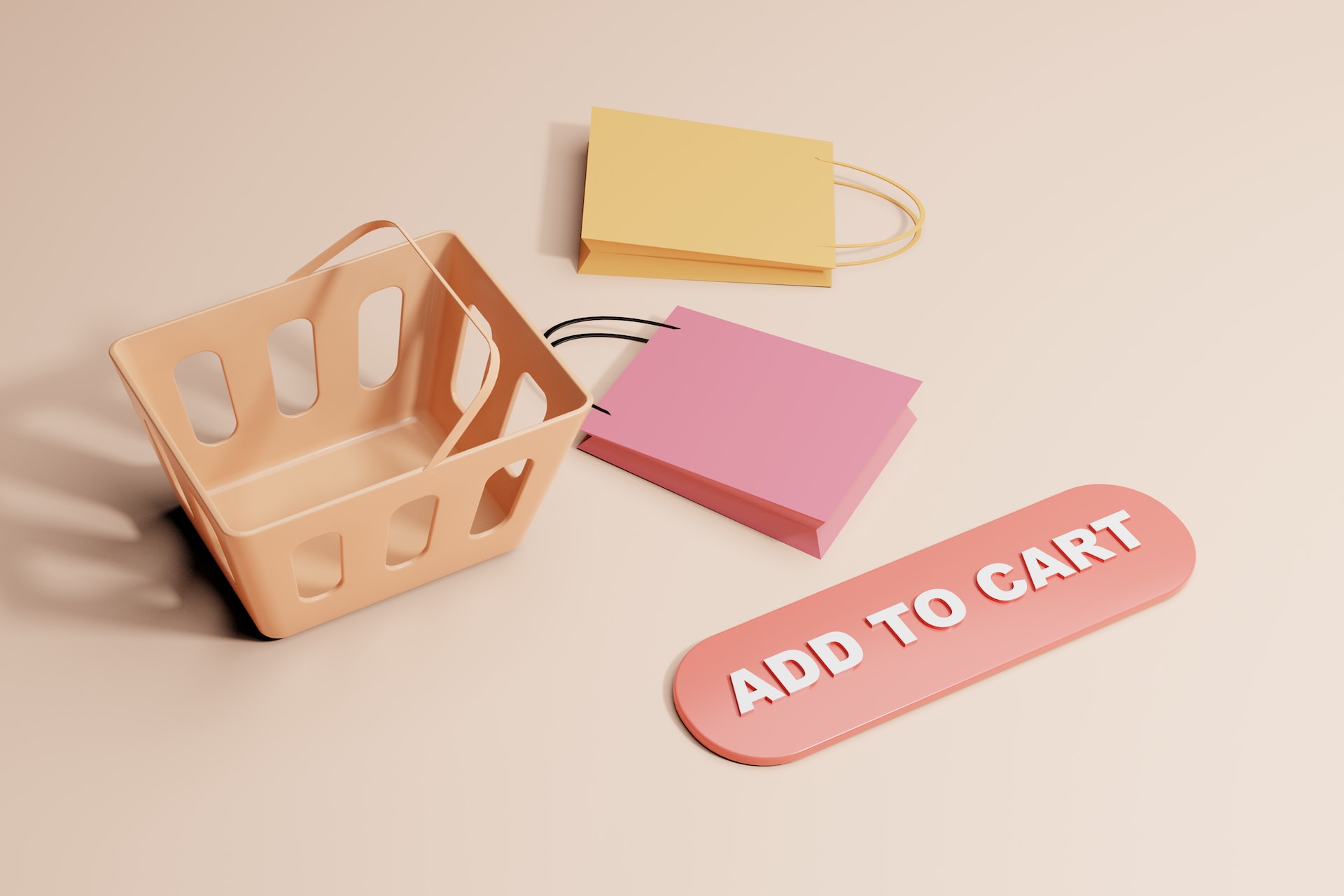
Call to Action (CTA): If your page includes a CTA, position it where the diagonal path intersects the horizontal path (top right or bottom left). Make it stand out with a contrasting color.
- Secondary Content
Placement: Information that’s less critical or supplementary can be positioned along the bottom right corner, where users tend to finish their scanning.
Footer: Include important links, contact information, and legal notices in the footer, which is typically found at the bottom right corner.
Responsive Design and the Z-Layout
Responsive web design is crucial to ensure that your website functions and looks great on various devices and screen sizes. When applying the Z-layout to responsive design, consider the following:
- Mobile Devices: On smaller screens, adapt the Z-layout vertically. Place important elements at the top of the page, followed by secondary content, and consider using mobile-friendly navigation menus.
- Tablets: Tablets provide more screen real estate, allowing for a layout that closely resembles the traditional Z-pattern.
- Desktop: On larger screens, maintain the Z-pattern but consider utilizing additional horizontal space for content or visuals.
Case Studies: Effective Z-Layout Examples
Let’s explore some real-world examples of websites that effectively implement the Z-layout to create visually appealing and user-friendly designs:
- Apple
Apple’s website exemplifies the Z-layout, with the logo at the top left, a prominent navigation menu at the top, and engaging visuals and content following the Z-pattern. Key product information, headlines, and CTAs are strategically placed to guide users along the path.
- Airbnb
Airbnb’s homepage utilizes the Z-layout by prominently featuring a search bar at the top left, followed by visually appealing destination images and travel options. As users scroll down, they encounter secondary content and recommendations.
- Amazon
Amazon employs the Z-layout effectively with the logo at the top left, a highly visible search bar, and a horizontal navigation menu. As users scroll down, they encounter featured products, personalized recommendations, and additional content.
Challenges and Considerations
While the Z-layout is a valuable guideline in web design, it’s essential to recognize that not all websites or pages fit this pattern perfectly. Some considerations and challenges include:
- Content Variability: Different types of content may require alternative layouts or grids. For example, long-form articles may follow a linear scroll, while landing pages may prioritize vertical or horizontal stacking of elements.
- User Testing: User behavior and preferences can vary. Conducting user testing and gathering feedback can help refine your design to better match your target audience’s expectations.
- Visual Interest: While the Z-layout is a useful starting point, don’t be afraid to introduce variations or elements that break the pattern to create visual interest and engagement.
Conclusion
The Z-layout is a fundamental concept in web design that leverages the natural scanning and reading patterns of users to create user-friendly and visually appealing websites. By strategically placing key elements along the Z-pattern, web designers can guide users through the content, emphasize important messages, and enhance the overall user experience.


